Quintus Type design 2024
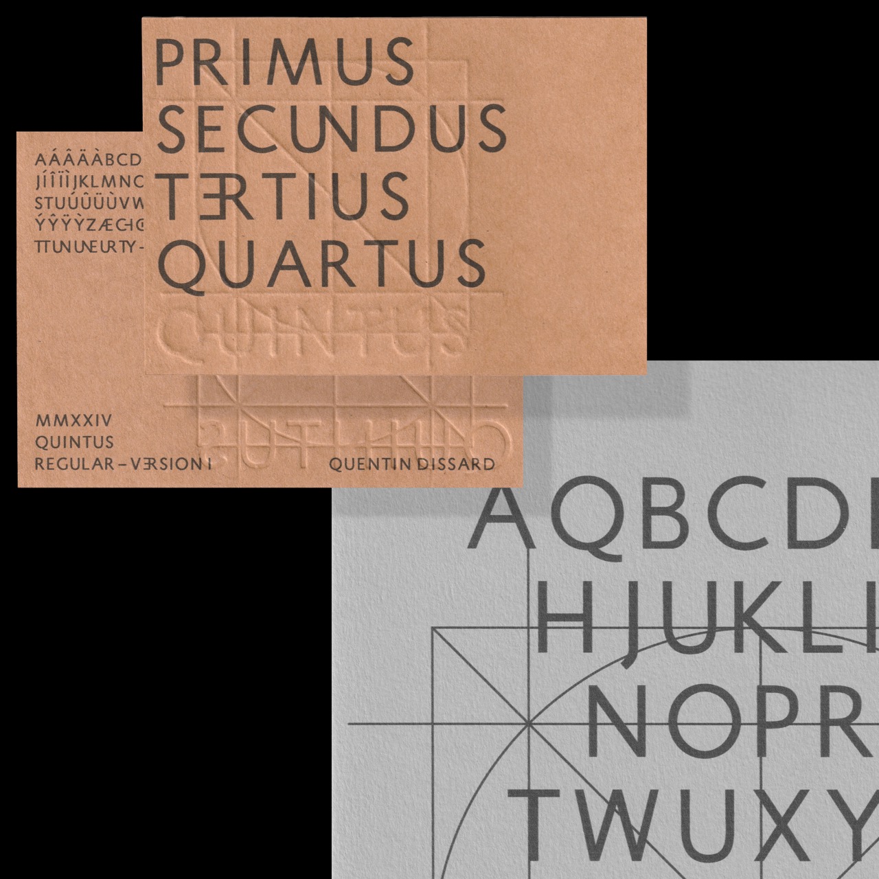
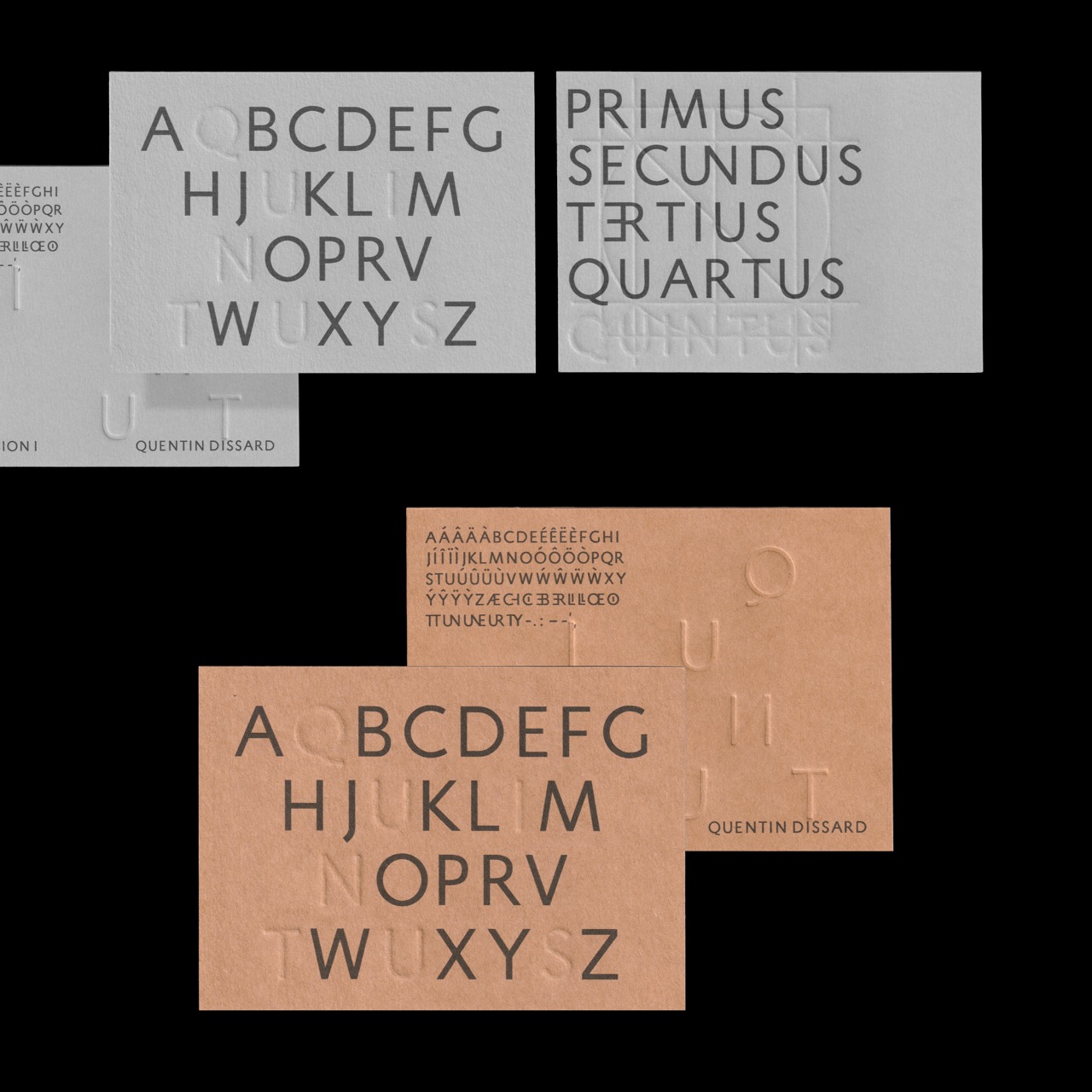
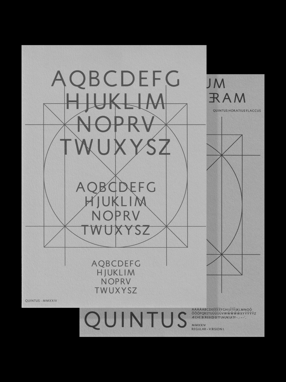
Quintus is a sans-serif typeface that respects Roman type traditions, including its specific shapes, construction, and proportions. The glyphset currently includes uppercase letters, basic punctuation, and French diacritics, but it is still a work in progress.
WIP
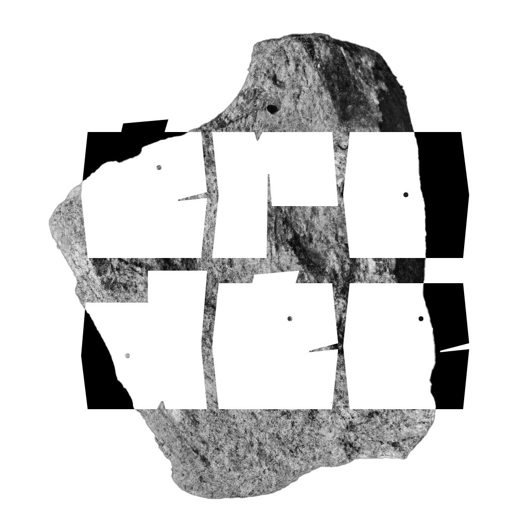
Montagnou Stone carving 2024
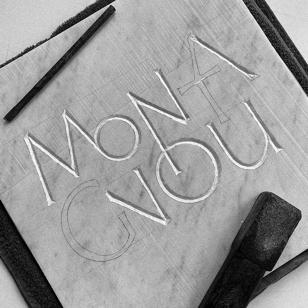
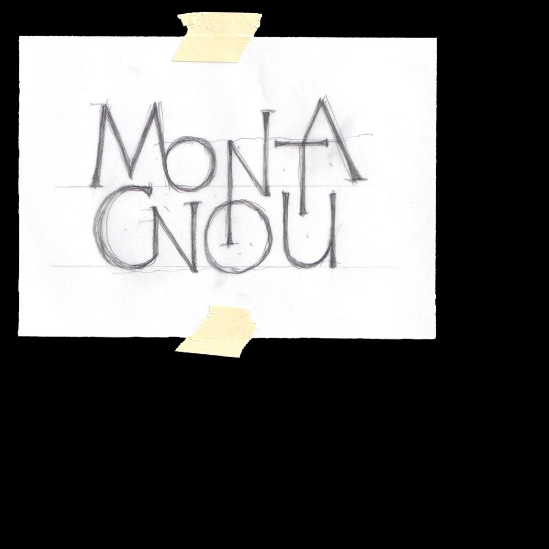
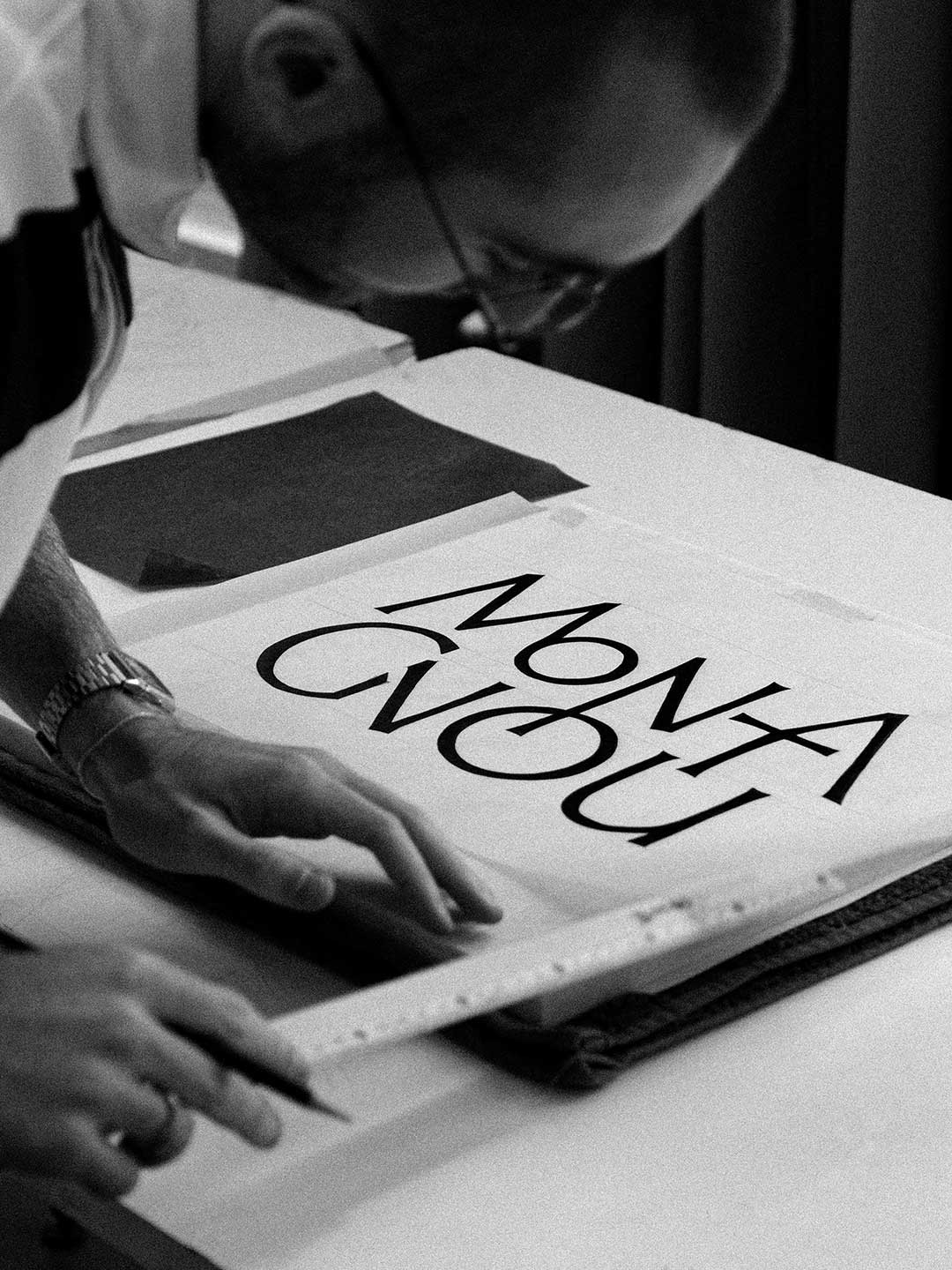
Introduction to stone carving with Franck Jalleau, by carving the name of the cheese made by my uncle, the Montagnou.
Beautiful pics by @hez.augustine ;)
450 x 450 mm
White marble
Language thread Letter painting 2024
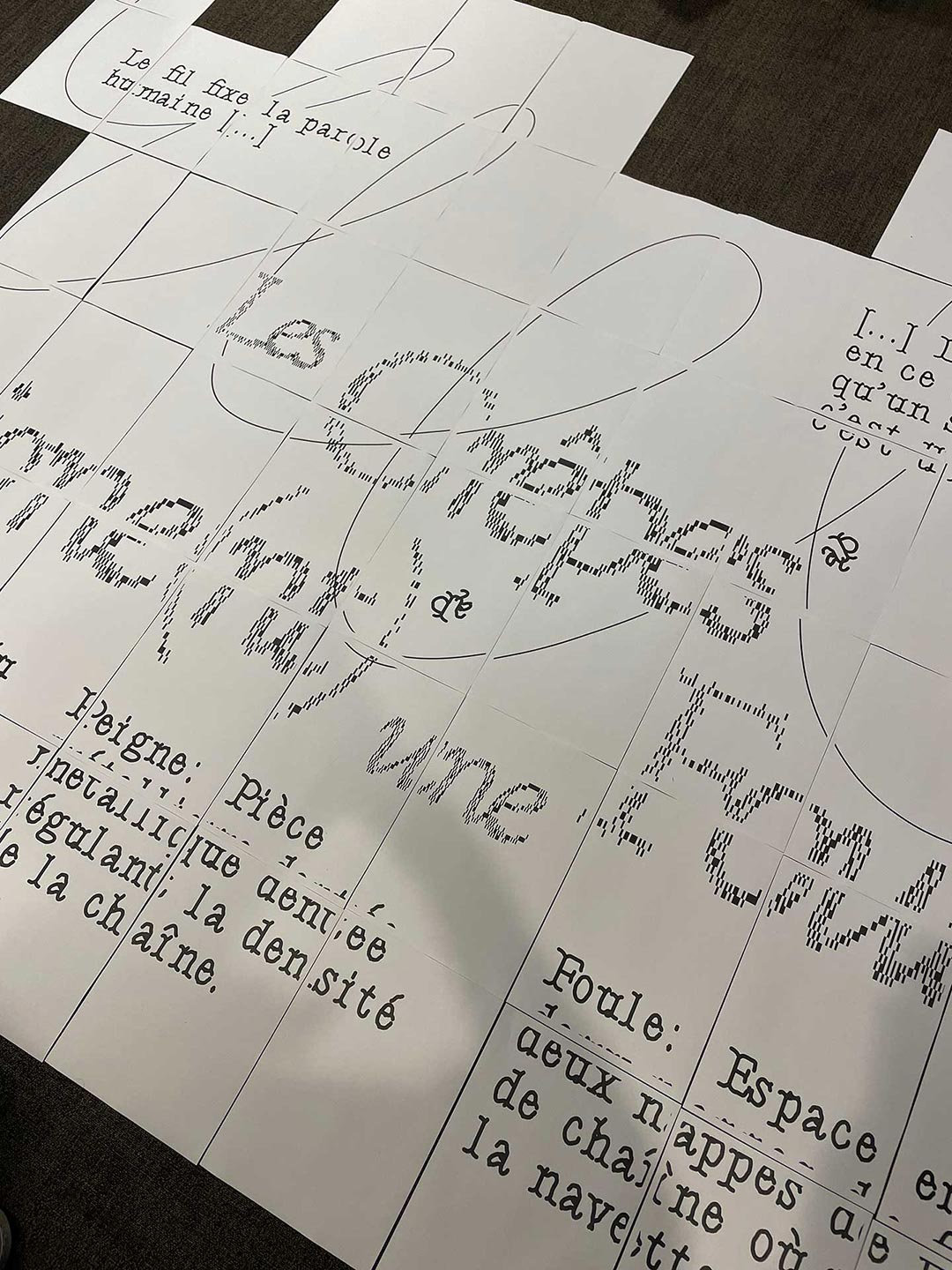
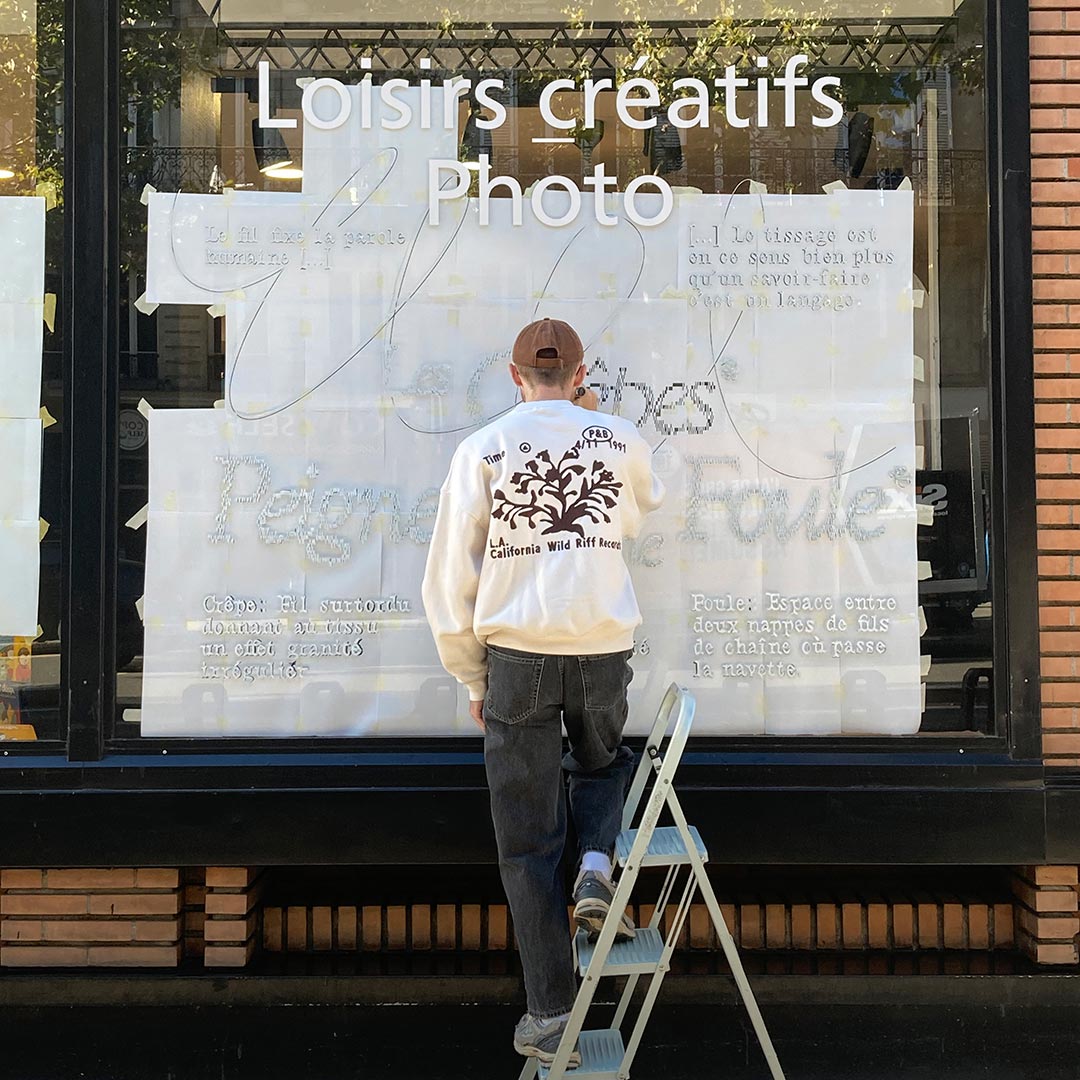
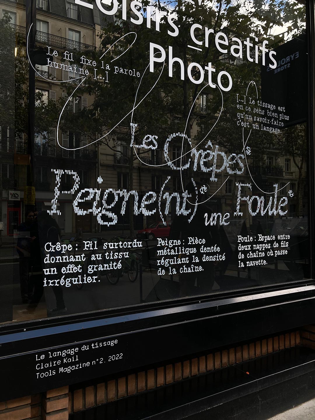
Weaving is common, since it is defined materially in the construction of links. Like an exquisite corpse, our project plays on the polysemy of words between terms from weaving and common language. This sentence, which, at first glance, provokes the absurd and arouses astonishment, invites the public to come closer to discover in detail the links between node and us.
2250 x 2290 mm
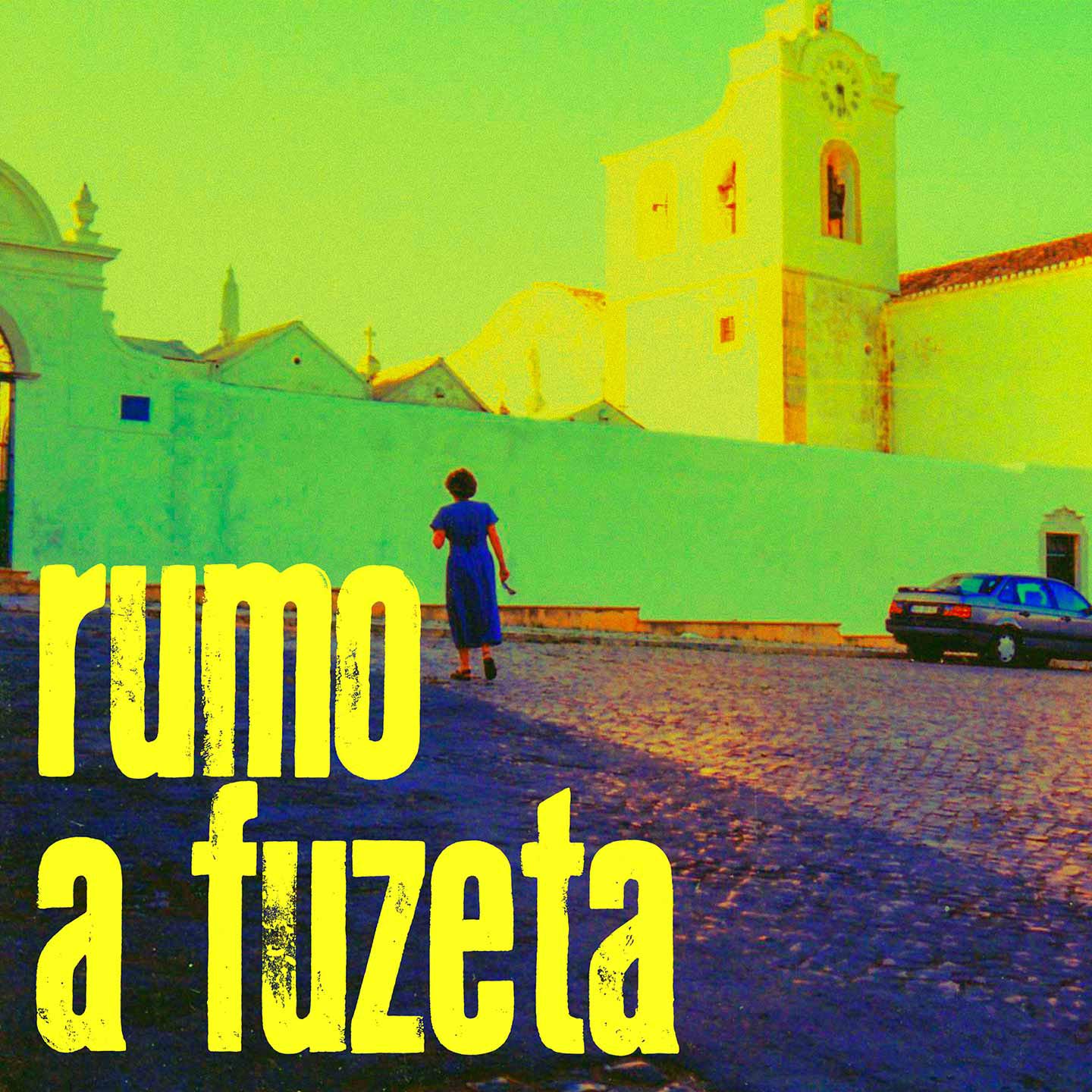
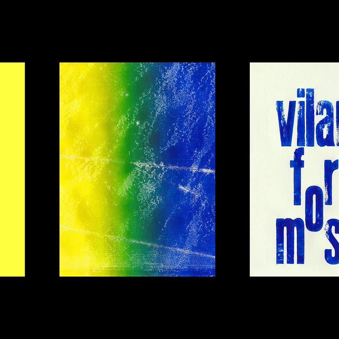
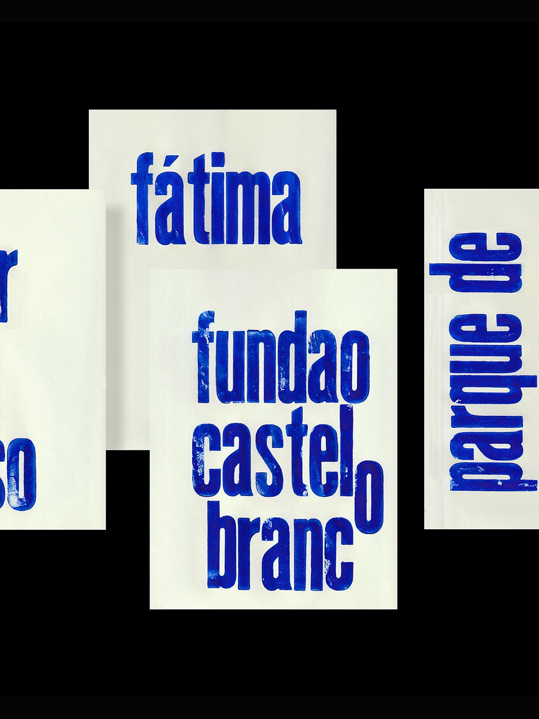
Towards fuzeta Wood type printing 2024
On the roads of my past vacations up to Fuzeta with old wooden letters recovered from the DSAA Boulbi
210 x 297 mm
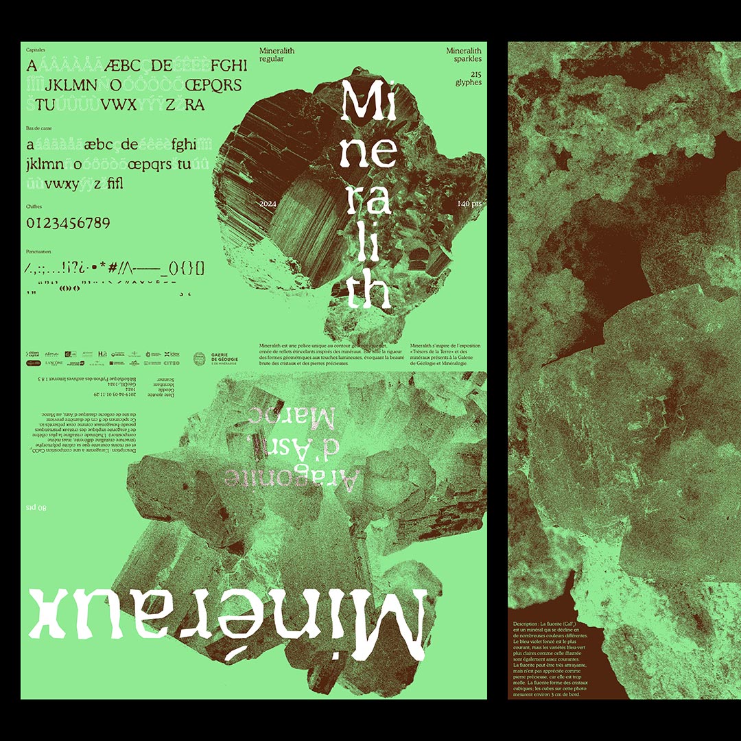
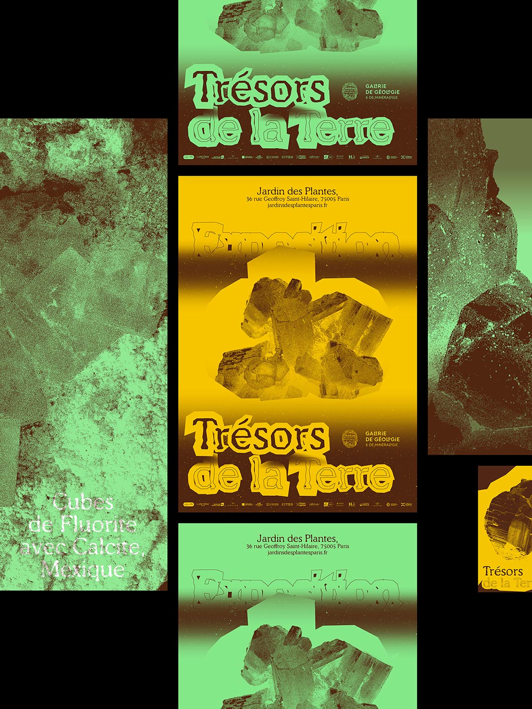
Treasures of the earth Type design 2024
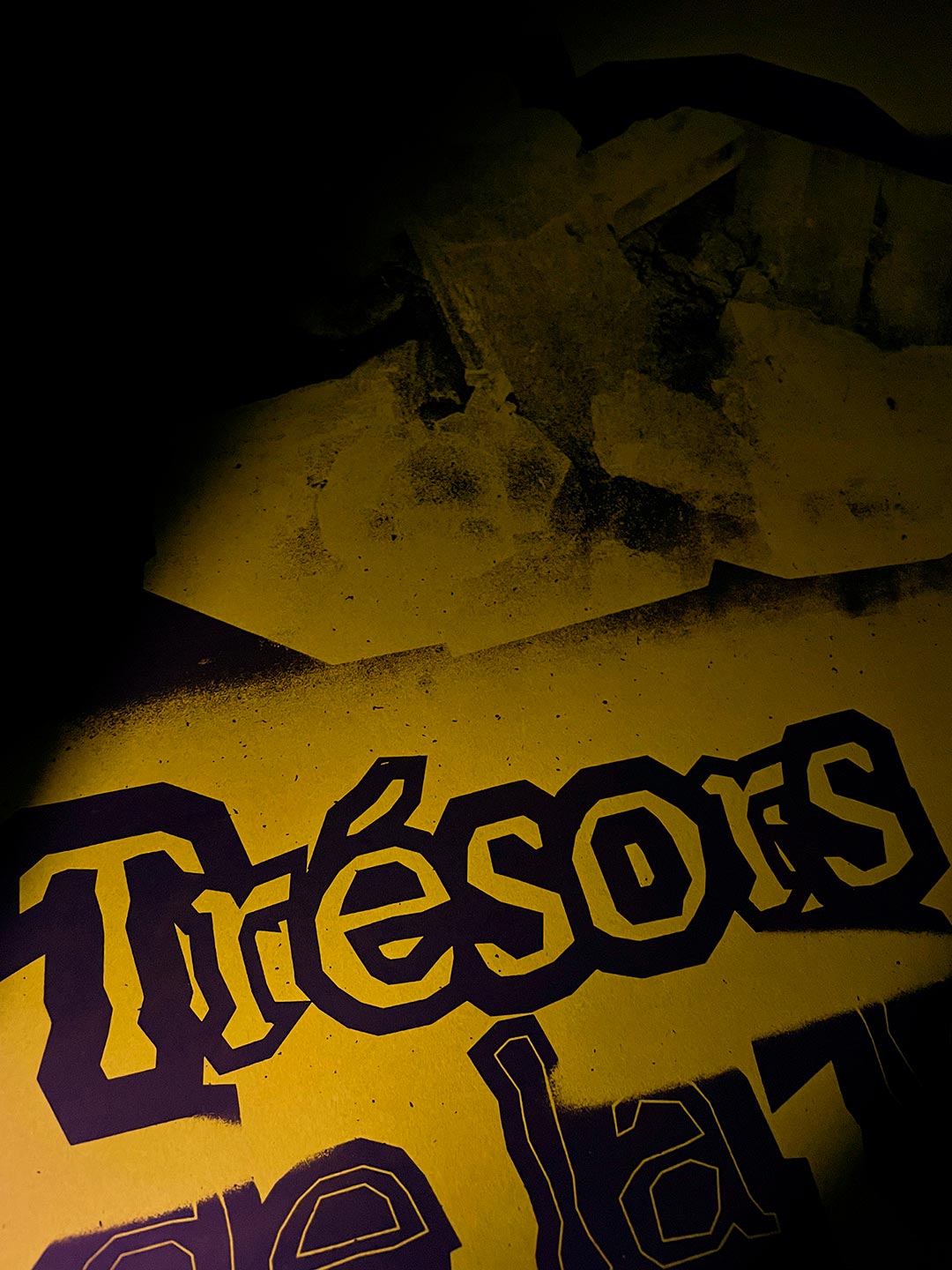
How can the richness of minerals be captured in typography ? My diploma project introduces a new typographic identity for the Gallery of Geology and Mineralogy's exhibition, « Treasures of the Earth » Like minerals shaped by environmental pressures, this typeface evolves with geometric yet imperfect forms. Its layered design includes a Sparkles style, adorned with shimmering reflections.
594 x 841 mm
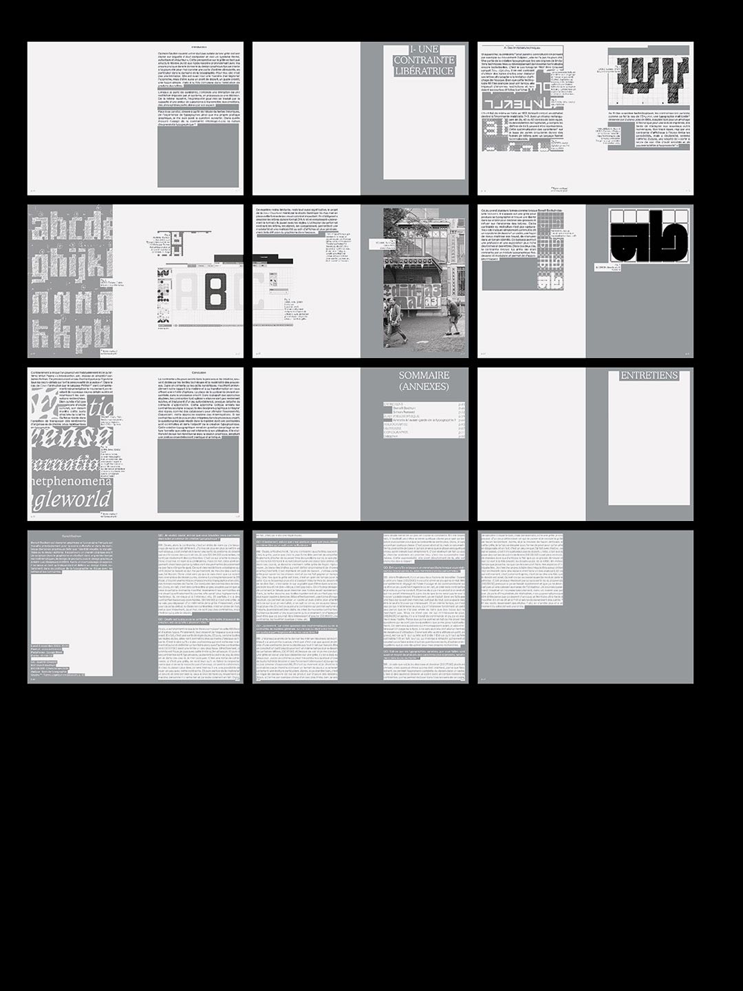
Typography under constraint Essay 2024
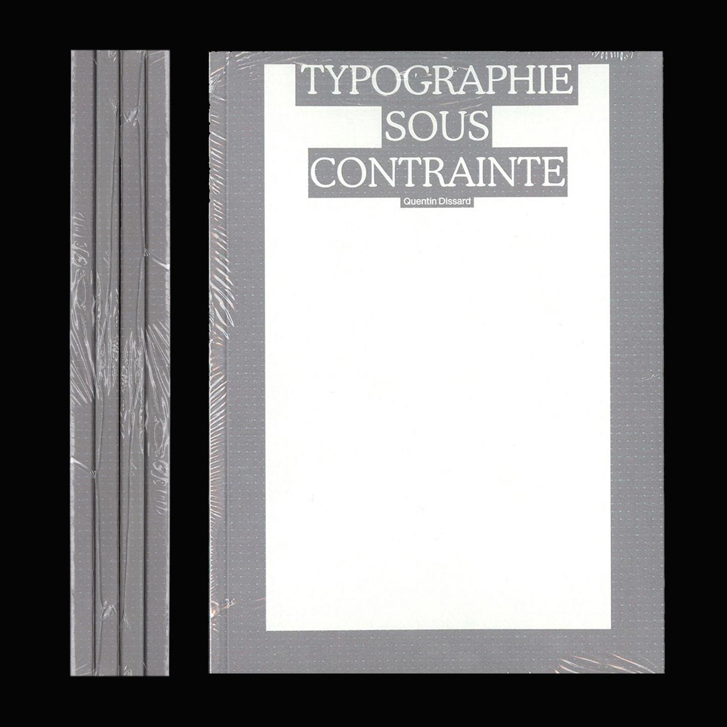
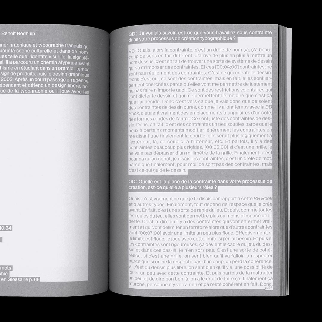
This research deals with constraints in typographic creation, from technical limitations to contemporary approaches, notably through the use of modules and grids as graphic tools. I question the way in which these constraints redefine the approach to typographic expressiveness and their impact.
142 x 202 mm
80 pages
4 copies
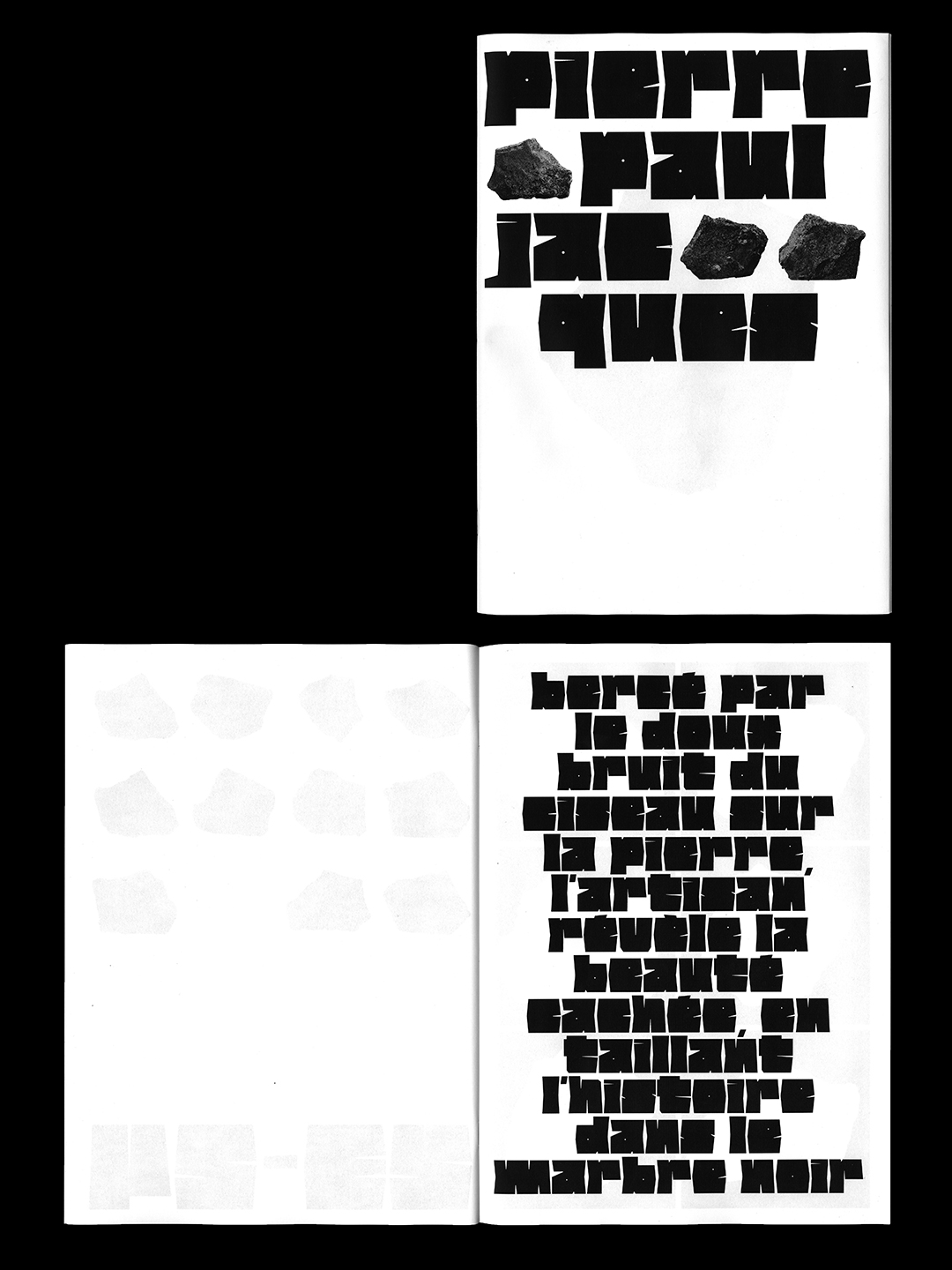
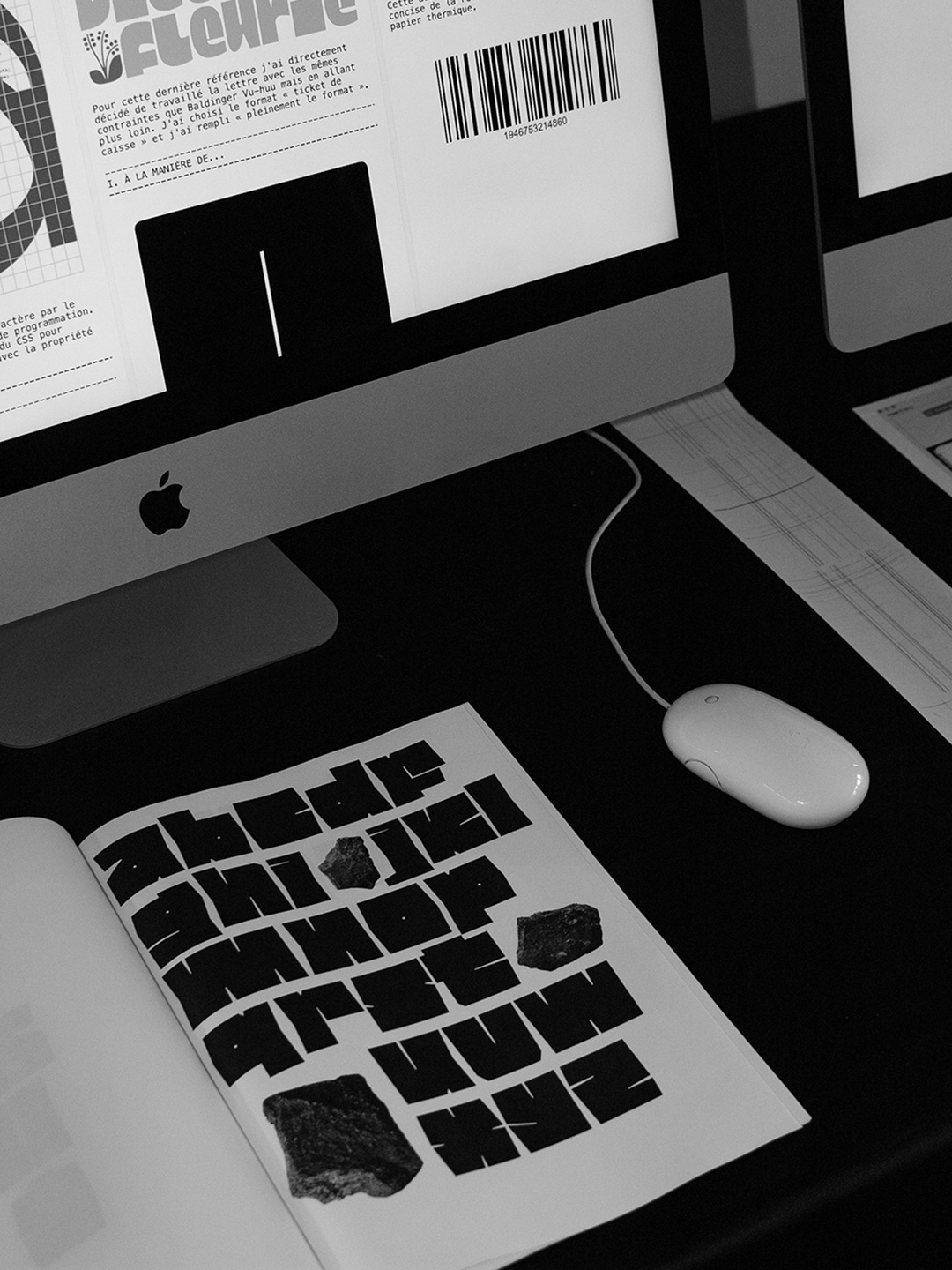
Pierre Paul Jacques Type design 2023
Typeface extracted from my essay research cell, designed within two constraints: (fully occupying the format) and (minimizing cuts into the letter). Reflecting its imperfect and irregular nature, Pierre conveys the sharp, abrupt, and sometimes radical gesture of carving into stone.
210 x 297 mm
1 copie
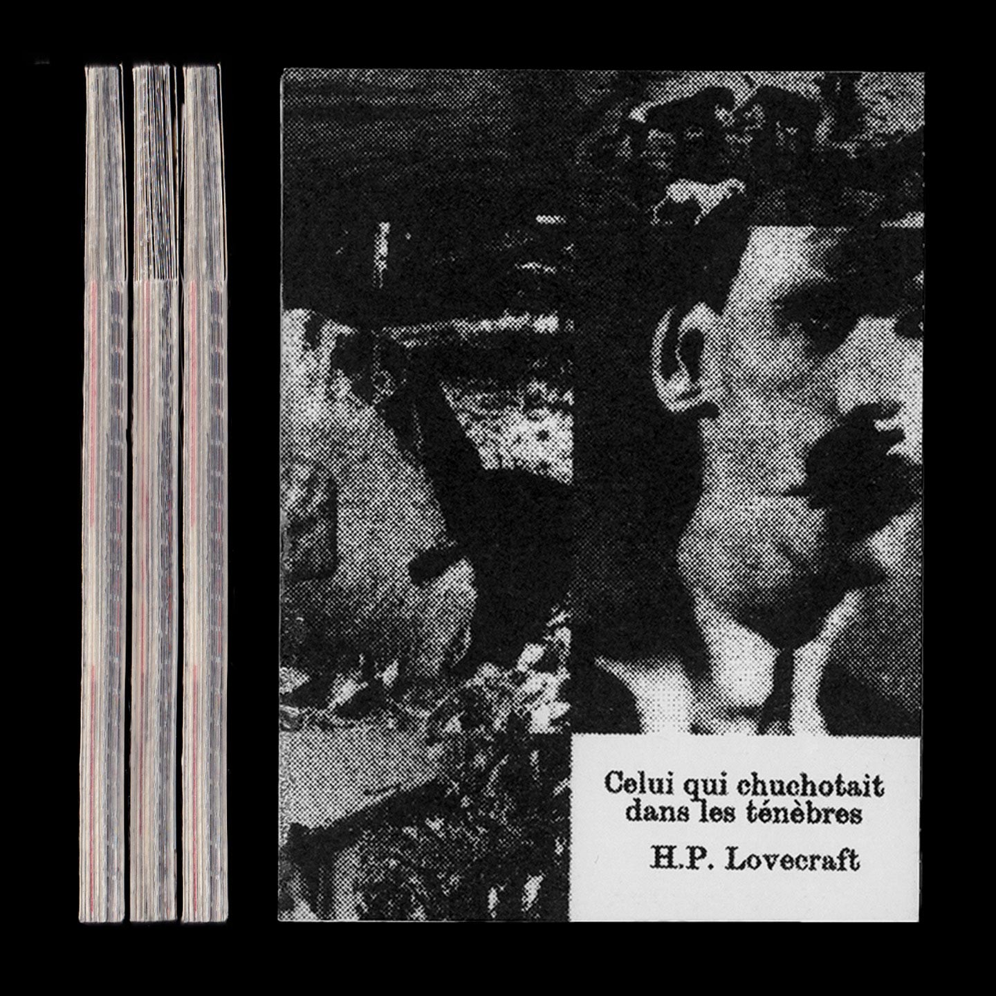
The Whisperer in Darkness Editorial design 2023
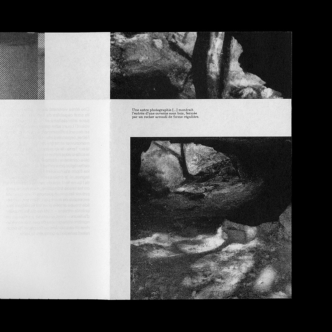
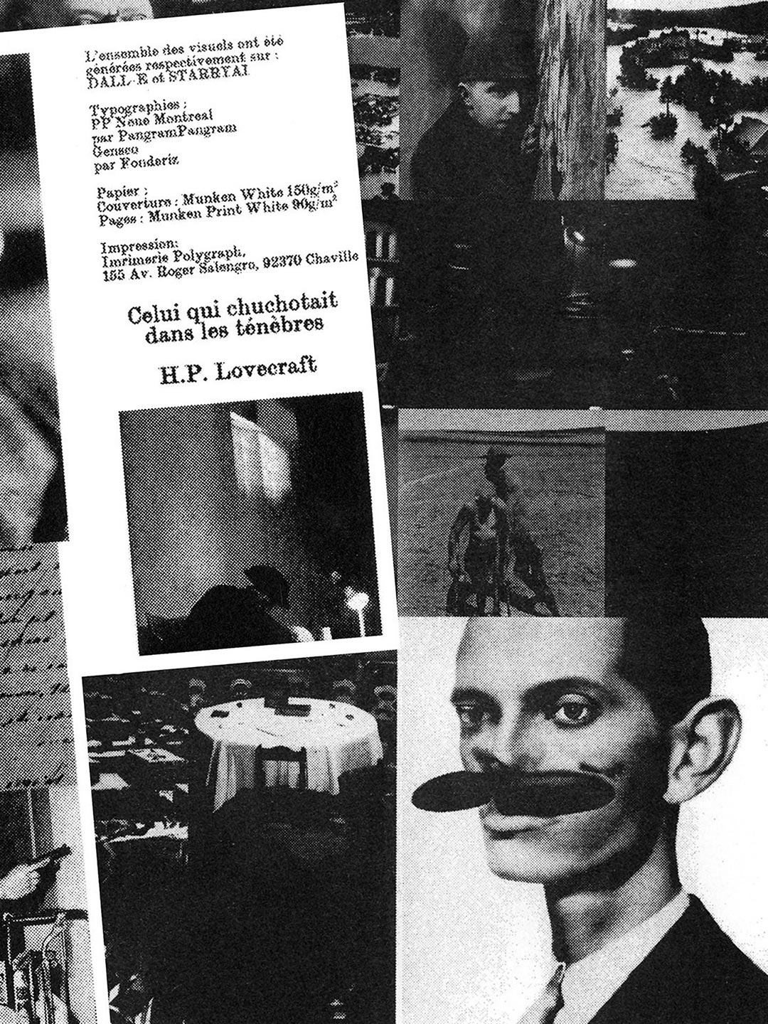
Reissue of the short story « The Whispered in the Darkness » by H.P. Lovecraft and integration of visuals in Augmented Reality. Typeset in« Gensco » by Cédric Rossignol-Brunet and printing by Polygraph.
150 x 200 mm
220 pages
3 copies
Specimen I Editorial & Type design 2023
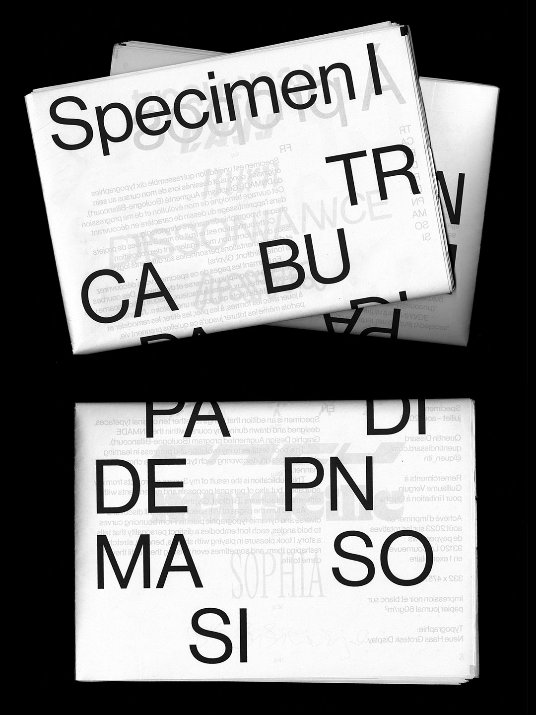
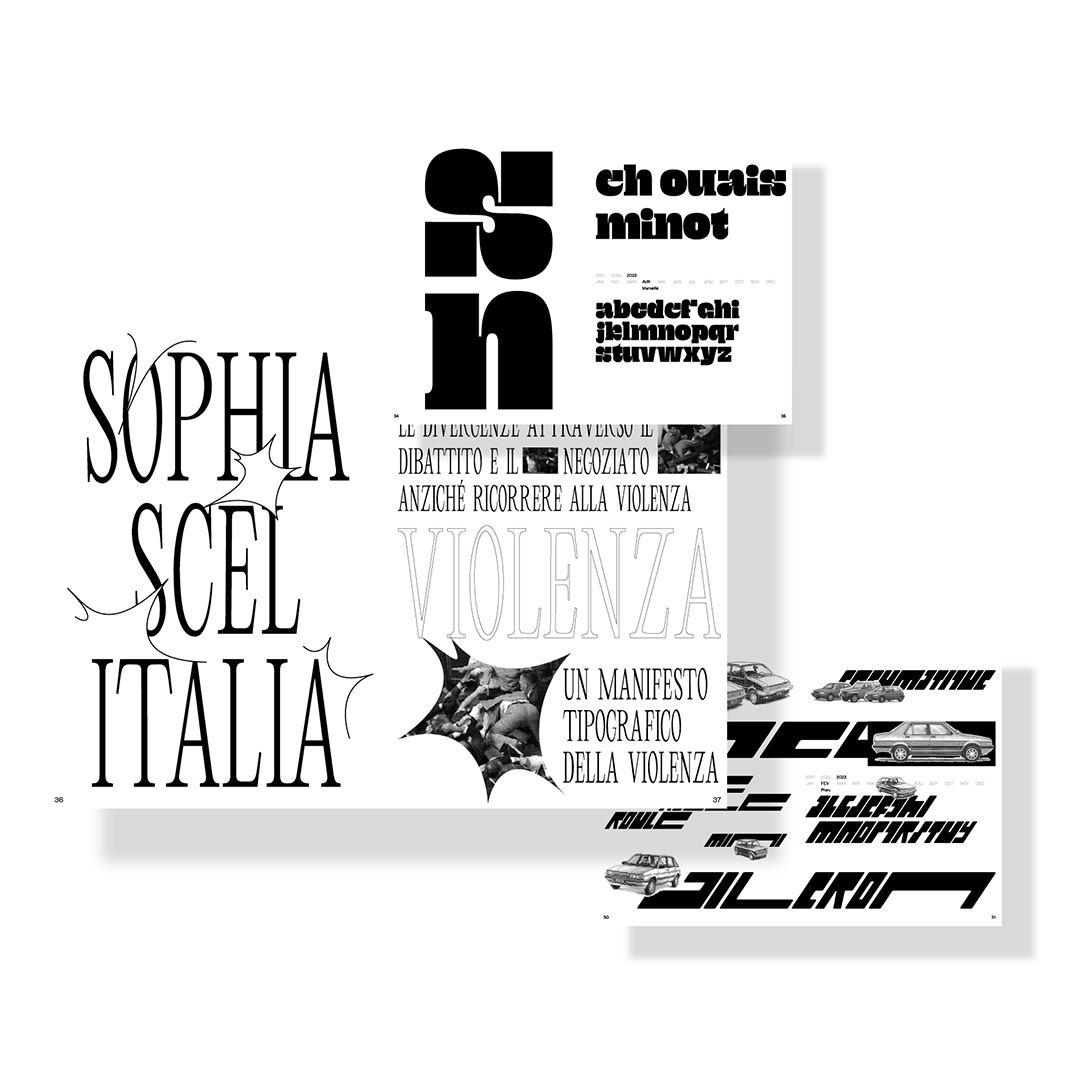
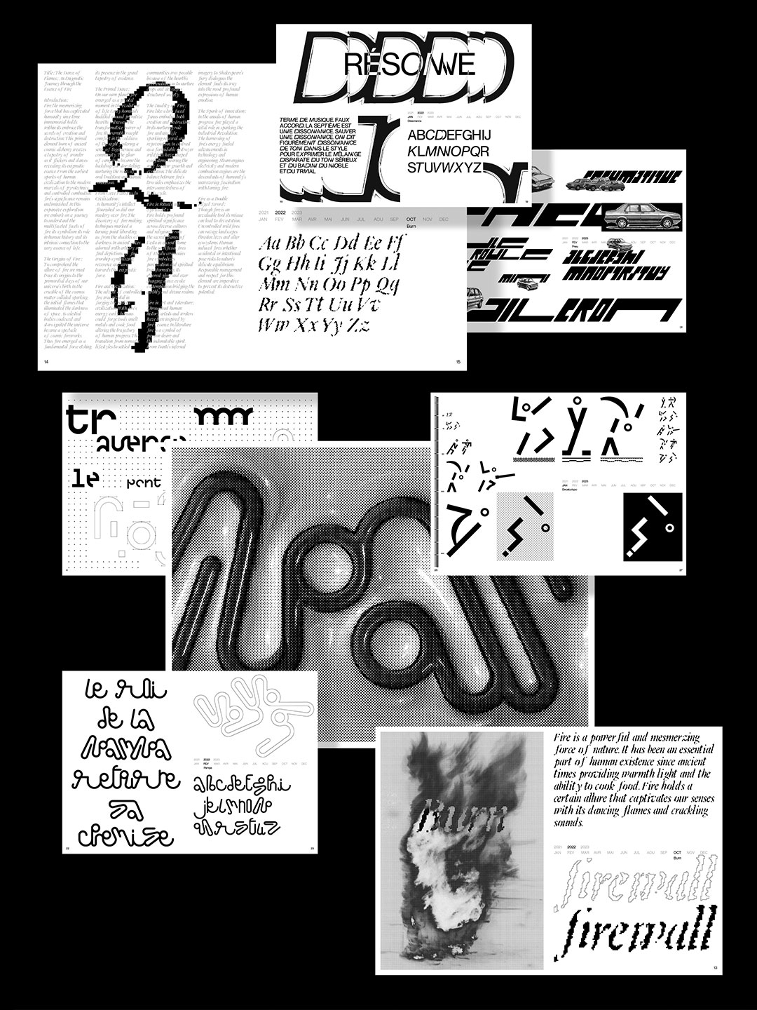
Retrospective newspaper showcasing and presenting 10 typefaces designed during my studies in the BFA Augmented Graphics. This publication is the result of three years of projects, as well as personal explorations and experiments using various software tools (Birdfont, Glyphs).
332 x 475 mm
2 copies
Fantastic Planet Screen printing 2022
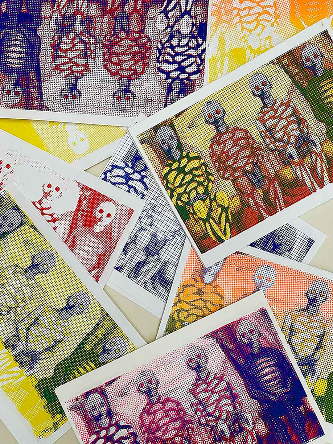
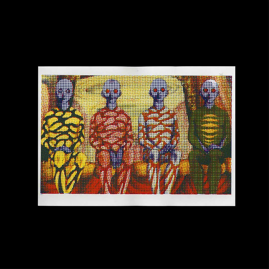
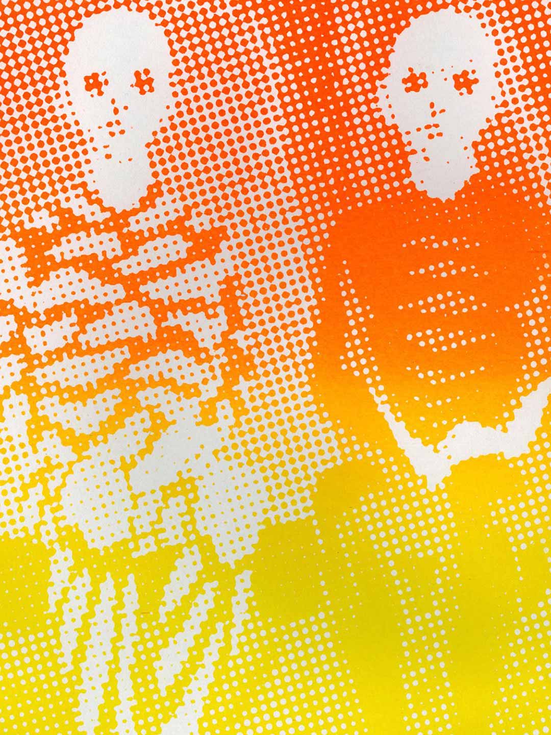
Direction and production with Louise Roo, Odilon Aouatah and Victor Facon four-color screen prints from the animated film The Fantastic Planet by René Laloux 1973.
297 x 420 mm
10 copies
